Section 4: Interpreting the Data
Contents
Section 4: Interpreting the Data
You should now have generated a clean dataset, showing the different BURs across the excerpt you analysed. Next, we need to analyse how the BUR changes across the passage.
Visualising your data
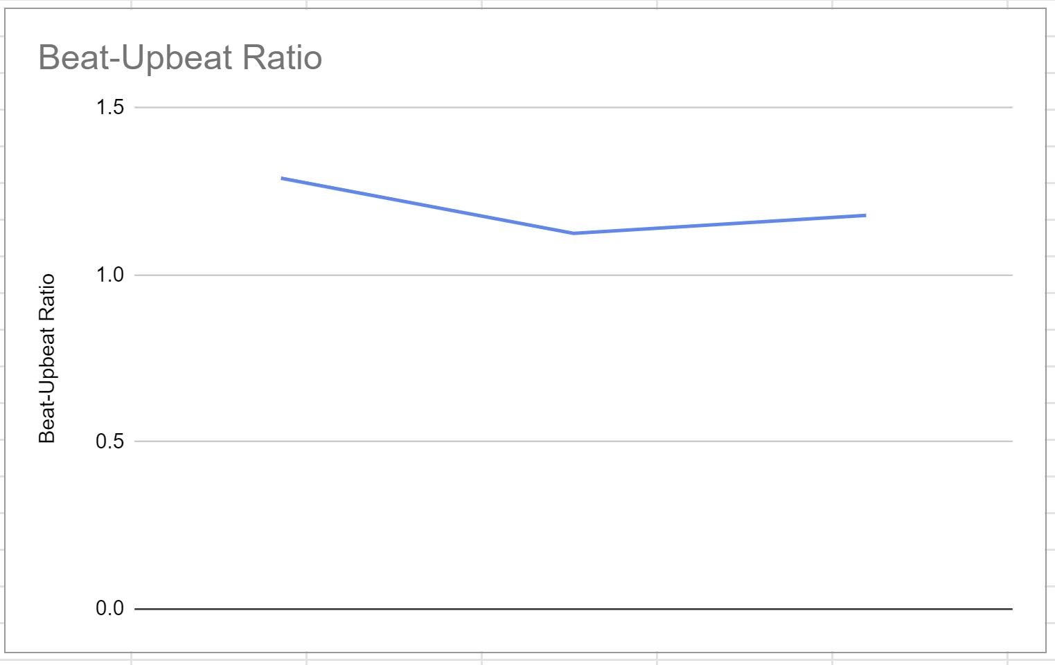
In your spreadsheet, select your BUR column and create a line chart by clicking the Insert tab (Excel) or Data tab (Sheets). Do you notice anything significant about the graph? For instance, do certain beat numbers (e.g. even or odd beats) have higher or lower BUR values? Can you see any particularly expressive types of BUR movement - for instance, the BUR surge Benadon describes?
If you want, you could try placing your BUR graph alongside the transcription of the excerpt you chose, as Benadon does in his paper. Another visualisation option would be to annotate the transcription with the BUR values.
Expected result:
Comparing your data
Take another look at the examples Benadon gives in his paper. Do you see any that look radically similar or different to your results? If you chose an excerpt by a musician that Benadon also studies (e.g. Dexter Gordon or Miles Davis), do your results for this musician contradict his? Why might this be?
Try and think about these issues when answering the questions on the following page!